
Content
Sephora AR App
I woke up yesterday morning and thought of this. I later found out Sephora already had an app which was pretty good to begin with. BUT! Here is my take. Mine can be an add-on/improvement. Why? Mine utilizes augmented reality. You basically have the app and you direct it the area of the black and white square near the product. Within seconds rates and reviews is a pop up pulling information off their main site. So this is live feedback. The same applies to the ingredients and similar bar which would direct you to another product. You do not need to pick up the object.


Garnier Redesign Part II - Logo
Labels:
evelyn lieu,
logo,
typography,
web design
These are some different takes on their logo. I kept their colors but gave it a twist. I liked their colored circles in their logo name. I used that idea and played around with some circles. Here are my designs.

Garnier Redesign
Labels:
evelyn lieu,
web design
Here are two layouts for Garnier USA's website. One I took a different approach with a dark mood. The other sticks with Garnier's "green" look. It's clean, its green, its organic.


L.E.I. Redesign Part II - Logo
Labels:
evelyn lieu,
logo,
typography,
web design
Here are the logo designs to go with the website.


L.E.I. Redesign
Labels:
evelyn lieu,
web design
Here we have L.E.I. a clothing line that is more well known for their jeans. According to wikipedia, this brand is popular among teenage girls from the ages 12 - 19. Their homepage seemed so lackluster. Here is my way of kicking it up a notch. Apparently Taylor Swift was their model for a while. Why not use her on your main website? I made it a little more fun but simple at the same time. Even made some logos to go with this.


Ebay Redesign
Labels:
evelyn lieu,
web design
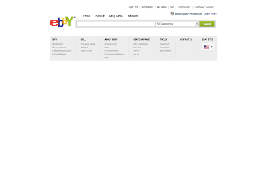
What we have here is a different concept/approach to Ebay. I took a minimalistic approach to redesigning it. And here are my ideas. I feel that the search part is most important for Ebay. Most people come looking for an item in mind. My concept is that it would resemble a search engine with real time results. Ebay does have a similar feature but it does not show thumbnails of the items. The additional element added to this is the Random feature. A plethora of items will be shown each from a different category. This is for people who are looking to buy something but are not sure what to or are looking for something interesting but is unsure of what to get.
The third design simply has more aspects shown such as the most popular item and ads. Ads are what helps websites with revenue so those are essential.


About Me

- Eve.L
Welcome to my Digital Media portfolio. All works shown here are the best finished pieces created during my three years at NYU-Poly.
This site is temporary until my official website is finished.
Please visit my deviantArt gallery Mayuiki for my artworks.
Other Links
Tumblr
Other Portfolio